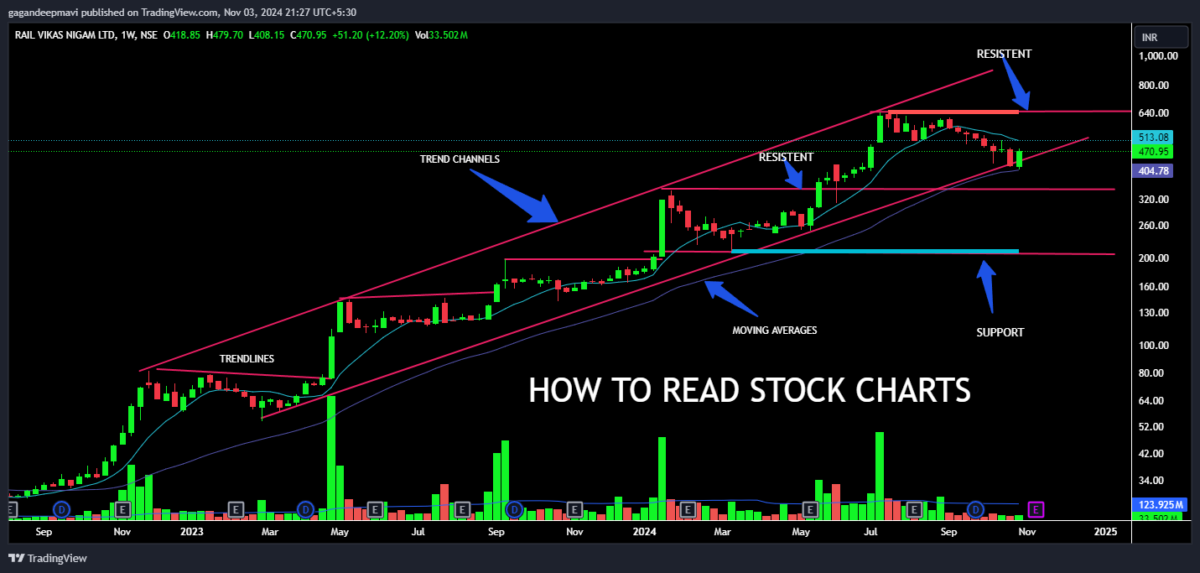
How to Read Stock Charts – Pro Tips
Introduction
When it comes to investing in the stock market, understanding stock charts can be a game-changer. Stock charts are powerful tools that give you a visual representation of price movement over time, helping you spot trends, patterns, and potential investment opportunities. But for beginners, these charts can seem overwhelming with their lines, bars, and various indicators. So, how do you go from just staring at a chart to actually making sense of it?
Learning to read stock charts isn’t just for professional traders; it’s an essential skill for anyone looking to make informed decisions in the market. Whether you’re a long-term investor, a day trader, or somewhere in between, knowing how to interpret stock charts can make a difference in your returns. In this guide, we’ll break down the different types of charts, key patterns to recognize, essential indicators, and some pro tips that will help you read charts like a seasoned analyst.
To dive deeper into various stock analysis techniques, check out Mavi Analytics’ blog, where you’ll find resources on everything from basic chart reading to advanced strategies.
1. Types of Stock Charts
When you first start reading stock charts, you’ll notice there are several types, each offering unique insights into stock performance. Here are the most common types and how they can help you in your analysis:
Line Charts
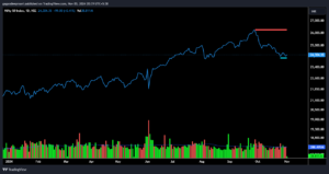
A line chart is the most straightforward type of stock chart, showing a simple line that connects closing prices over a period. This chart is best for a quick overview of a stock’s price trend and is commonly used for long-term analysis, as it smooths out short-term fluctuations. It’s not detailed, but it’s great for beginners who want a basic understanding of how a stock has performed.
Bar Charts
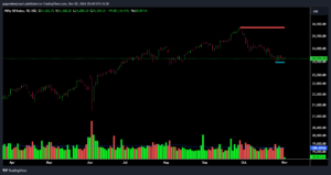
A bar chart gives you a bit more detail. It shows the stock’s open, high, low, and close prices for each period, also known as the OHLC data. A vertical line represents the range between the high and low, while horizontal ticks on the left and right indicate the opening and closing prices. Bar charts are helpful for understanding daily price volatility and can be used across different time frames. You can find more about daily chart analysis on Mavi Analytics.
Candlestick Charts
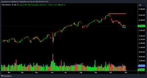
Candlestick charts are a favorite among traders because they provide a lot of information at a glance. Each “candle” represents a trading period, and its shape and color show whether the price went up or down. A filled (often red) candle means the stock closed lower than it opened, while an unfilled (often green) candle means it closed higher. Candlestick patterns, such as dojis and hammers, can signal potential reversals or continuation trends. For a comprehensive look into candlestick patterns, you might want to check out more articles on Mavi Analytics.
Other Chart Types (Heikin-Ashi, Point and Figure, Renko)
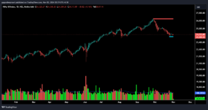
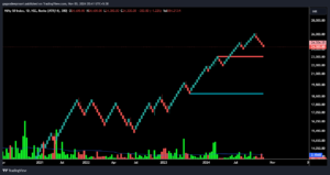
For traders looking for something beyond the basics, alternative chart types like Heikin-Ashi, Point and Figure, and Renko provide unique insights:
- Heikin-Ashi: This chart smooths out price action, making trends easier to spot by averaging price data.
- Point and Figure: This chart focuses on price movement, ignoring time, which makes it ideal for spotting long-term trends.
- Renko: Similar to Point and Figure, Renko charts only update when the price moves by a certain amount, filtering out minor fluctuations and clarifying major trends.
Each chart type has its own advantages, depending on your trading style. If you’re interested in a deeper dive into these charts, Mavi Analytics’ blog has some fantastic resources on alternative charting techniques.
2. Understanding Stock Chart Components
Stock charts may look complex at first glance, but they’re made up of a few key components that, once understood, make it much easier to interpret price movement and market behavior. Let’s explore each of these parts in detail.
Price Axis (Y-axis)
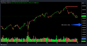
The Y-axis of a stock chart shows the price of the stock. Typically located on the right side, this axis scales according to the highest and lowest prices within the selected time frame. If you zoom in to view a stock’s performance over a single day, for example, you’ll see a range that reflects the high and low prices within that specific period. Understanding the price scale is important, especially when analyzing fast-moving stocks where price fluctuations can be substantial.
For a more in-depth explanation of stock price movement, Mavi Analytics offers resources on interpreting these shifts and spotting trends.
Time Axis (X-axis)
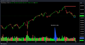
The X-axis displays time, helping you analyze price movement over a specific period. Stock charts can be customized to show different time frames—ranging from intraday (minutes or hours) to daily, weekly, or even monthly data.
The time frame you select depends on your trading strategy:
- Short-term traders might prefer to look at hourly or minute-based charts.
- Long-term investors often analyze weekly or monthly charts for broader trends.
Each time frame reveals unique insights. For instance, a short-term chart may show a minor dip, but a long-term chart might reveal that the stock is actually in an uptrend. Choosing the right time frame is crucial, and Mavi Analytics provides valuable insights on determining the ideal time frame for various investment strategies.
Volume
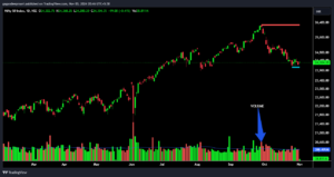
Volume is an often-overlooked but crucial component of stock charts. Represented by vertical bars at the bottom of the chart, volume shows how many shares were traded in a given period. High volume indicates strong interest in a stock, while low volume suggests weaker interest.
Understanding volume can help you confirm price trends:
- High volume with rising prices typically signals strong buying interest and can confirm an uptrend.
- Low volume with rising prices could indicate a weaker uptrend or potential reversal.
- High volume with falling prices suggests strong selling interest, often confirming a downtrend.
Volume also helps you identify patterns in trading behavior, which is especially useful for identifying potential breakout or reversal points. Mavi Analytics has extensive resources on how volume impacts stock trends and trader sentiment.
Indicators and Tools
Indicators are formulas that help traders analyze stock price movements and trends. They overlay on the price chart or are displayed in a separate pane below it. Some popular indicators include moving averages, Bollinger Bands, and the Relative Strength Index (RSI).
Here’s a quick overview of some commonly used indicators:
- Moving Averages (MA): Moving averages smooth out price data to help you identify the overall trend. Common types include the simple moving average (SMA) and the exponential moving average (EMA), which react more quickly to price changes. You can learn more about these indicators in Mavi Analytics’ guide to moving averages.
- Bollinger Bands: Bollinger Bands measure volatility and help traders identify potential breakout and breakdown points. When prices move near the upper or lower band, it often signals that a reversal may be approaching.
- Relative Strength Index (RSI): RSI measures the speed and change of price movements, showing whether a stock is overbought or oversold. RSI values above 70 indicate an overbought condition, while values below 30 suggest it might be oversold.
Each indicator serves a different purpose and helps traders make more informed decisions. Mastering a few key indicators can make a big difference in your ability to interpret stock charts, and Mavi Analytics provides in-depth tutorials on using each of these indicators for maximum effect.
3. Key Chart Patterns to Recognize
Chart patterns are specific formations created by stock price movements that can indicate potential market trends and reversals. Learning to spot these patterns early can help traders make timely decisions. In this section, I’ll cover some of the most essential patterns you’ll encounter in stock charts, helping you recognize when a trend might continue or reverse.
Trend Lines and Channels
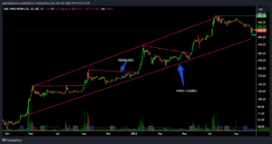
Trend lines are lines drawn on a stock chart to connect points of higher lows (uptrend) or lower highs (downtrend). They help you identify the general direction of a stock’s price movement over time. Channels are created when you draw two parallel trend lines—one connecting the higher lows and another connecting the lower highs—providing a range within which the stock price fluctuates. http://TRADINGVIEW.COM excellent tool to analyze charts.
Channels and trend lines are simple but effective tools for identifying trends and determining entry or exit points. Mavi Analytics provides a detailed guide to identifying trends and channels to help traders spot these patterns.
Support and Resistance
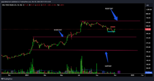
Support and resistance levels represent price points where a stock has historically struggled to go below (support) or above (resistance). These levels help traders gauge potential turning points:
- Support: A price level where buying interest typically outweighs selling, creating a “floor” that prevents the stock from falling lower.
- Resistance: A price level where selling pressure outweighs buying, creating a “ceiling” that prevents the stock from rising higher.
When a stock price breaks through a support or resistance level, it can signal a continuation or reversal of the current trend. To learn more about using support and resistance in trading strategies, check out Mavi Analytics’ resources on support and resistance.
Head and Shoulders
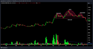
The head and shoulders pattern is a classic reversal pattern that often signals a shift in trend. It consists of three peaks: a higher peak (head) between two lower peaks (shoulders). When the price breaks below the “neckline” (a support line connecting the two troughs), it typically indicates a bearish reversal.
Inverted head and shoulders, where the peaks are below the baseline, often signal a bullish reversal. This pattern is popular among technical analysts for its high accuracy in predicting trend changes, and you can explore more examples in Mavi Analytics’ guide to reversal patterns.
Triangles and Flags
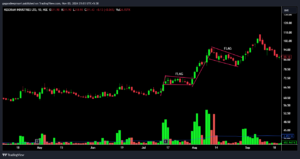
Triangles and flags are continuation patterns that signal the likelihood of a trend resuming after a brief consolidation.
- Triangles: Formed by converging trend lines, triangles (ascending, descending, or symmetrical) show decreasing volatility and are usually followed by a breakout.
- Flags: Flag patterns form after a strong price movement and look like a small rectangle slanting against the trend. When a stock breaks out from a flag pattern, it often continues in the direction of the original trend.
Flags and triangles are useful for spotting potential breakout points and can guide traders on when to enter or exit trades.
Double Tops and Bottoms
Double tops and bottoms are reversal patterns that signal a potential change in trend direction:
- Double Top: This pattern appears when the price reaches a high point twice without breaking it, indicating resistance. After the second peak, the stock often reverses downwards.
- Double Bottom: The opposite of a double top, this pattern occurs when the price hits a low point twice and rebounds, suggesting a possible upward reversal.
Recognizing these patterns can help you anticipate market shifts and make better trading decisions. Mavi Analytics covers these and other reversal patterns to give you a clearer understanding of market dynamics.
Cup and Handle
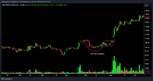
The Cup and Handle pattern is a bullish continuation pattern that resembles the shape of a teacup. It’s a pattern seen during uptrends, signaling a potential breakout to higher prices. Here’s how it forms:
- Cup Formation: The stock experiences a rounded decline and then gradually recovers to the original price level, forming a U-shaped curve. This part represents the “cup.”
- Handle Formation: After reaching the prior high, the stock usually experiences a minor pullback or consolidation, forming the “handle.”
- Breakout: Once the price breaks above the resistance level (the height of the cup), it typically signals the start of an uptrend.
The Cup and Handle pattern is widely followed because it can indicate a strong buying opportunity. Look for volume to increase as the price approaches the breakout point, which confirms buying strength. For more detailed insights into continuation patterns like this, check out Mavi Analytics’ guide on stock chart patterns.
VCP (Volatility Contraction Pattern)
The Volatility Contraction Pattern (VCP) is a relatively advanced chart pattern popularized by investor Mark Minervini. It’s a pattern that typically appears before a breakout, characterized by a series of increasingly smaller price swings and lower highs, signaling that the stock’s volatility is contracting. Here’s how to recognize a VCP:
- Decreasing Volatility: Price swings become narrower over time, with each pullback smaller than the previous one.
- Tighter Price Range: The stock’s highs and lows converge toward a specific price range, showing that buying and selling pressures are reaching a balance.
- Breakout: A significant breakout often follows this contraction phase, as volume surges and price breaks above resistance.
Traders use the VCP to identify potential breakout stocks, often setting buy orders above the high of the latest contraction. It’s a highly effective pattern when paired with strong volume indicators. Learn more about advanced breakout patterns like the VCP on Mavi Analytics.
4. Essential Indicators for Stock Charts
Indicators are mathematical calculations based on a stock’s price, volume, or other data. They’re invaluable tools that help traders gain insights into trends, momentum, and potential reversals. Here are some key indicators every trader should know:
Moving Averages (MA)
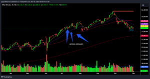
Moving averages smooth out price data, helping you spot trends by eliminating short-term fluctuations. There are several types of moving averages:
- Simple Moving Average (SMA): Calculated by averaging a set of prices over a specific period. It provides a clear view of the general trend.
- Exponential Moving Average (EMA): Gives more weight to recent prices, making it more responsive to current price changes.
For example, a common strategy is to watch for a “golden cross” (when a short-term MA crosses above a long-term MA, signaling a potential uptrend) or a “death cross” (when the short-term MA crosses below the long-term MA, signaling a potential downtrend). For a deeper dive, refer to Mavi Analytics’ guide to moving averages.
Relative Strength Index (RSI)
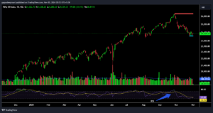
RSI is a momentum oscillator that measures the speed and change of price movements, ranging from 0 to 100. An RSI above 70 suggests that the stock is overbought (indicating a possible sell signal), while an RSI below 30 suggests that it’s oversold (indicating a potential buy signal). Traders use RSI to gauge whether a stock’s recent gains or losses are due for a correction, helping them anticipate reversals.
MACD (Moving Average Convergence Divergence)
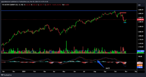
The MACD indicator tracks momentum by comparing two moving averages, typically the 12-day and 26-day EMAs. It’s displayed as a line that oscillates around zero, with positive values signaling bullish momentum and negative values indicating bearish momentum. The MACD’s signal line (often the 9-day EMA) helps confirm trends when it crosses the main MACD line:
- Bullish crossover: When the MACD line crosses above the signal line.
- Bearish crossover: When the MACD line crosses below the signal line.
MACD is ideal for understanding the strength of a trend and spotting potential reversal points. Check out Mavi Analytics’ resources on momentum indicators for further reading.
Bollinger Bands
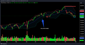
Bollinger Bands are a volatility indicator that consists of a middle SMA line and two outer bands, which adjust to price volatility. The bands widen during volatile periods and contract when the market is stable. When the price nears the upper band, it’s often a sign that the stock is overbought, and when it’s near the lower band, the stock might be oversold. Many traders use Bollinger Bands to identify potential reversal points or to set target prices during volatile market conditions.
Stochastic Oscillator
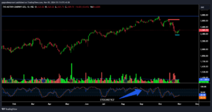
The stochastic oscillator is another momentum indicator that compares a stock’s closing price to its range over a specific period. It provides insight into potential trend reversals, especially when combined with other indicators like RSI. A stochastic value above 80 signals an overbought condition, while a value below 20 signals an oversold condition. When the indicator crosses above 20 or below 80, it can signal a shift in momentum.
For more on combining indicators to enhance your analysis, see Mavi Analytics’ guide on technical indicators.
5. Time Frames: Which to Use and When
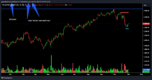
Choosing the right time frame is key to accurate stock analysis and should align with your trading style. Different time frames reveal different levels of detail:
- Intraday Time Frames (e.g., 5-minute, 15-minute): Ideal for day traders looking to make quick trades within a single trading session. Intraday charts provide fine-grained data that captures short-term trends.
- Daily Time Frames: Popular among swing traders, the daily time frame shows one trading session per bar, which helps capture intermediate trends over days or weeks.
- Weekly and Monthly Time Frames: Best for long-term investors who want to understand the broader market direction without getting caught up in short-term fluctuations.
Each time frame offers distinct insights into price behavior, helping you find the right fit for your strategy. Mavi Analytics has resources on time frame selection based on various trading goals.
6. Using Charting Platforms
Several platforms provide comprehensive charting tools, each with unique features to enhance your analysis. Here are some popular options:
- TradingView: Known for its user-friendly interface and robust technical indicators, TradingView is popular among beginners and advanced traders alike. It also includes social features, allowing users to share ideas and analysis with others.
- StockCharts.com: A great choice for those who want in-depth charting options, StockCharts offers a variety of tools and indicators for thorough technical analysis.
- Finviz: Finviz is more than just a charting tool; it offers powerful stock screeners, heat maps, and news feeds to keep you updated on market developments.
- INVESTING.COM: Known for its high-level analysis tools, Thinkorswim is favored by professional traders for its advanced charting and technical analysis capabilities.
- Yahoo Finance: An easy-to-use platform that offers basic charting options, Yahoo Finance is a go-to for those who need quick data and news integration.
These platforms each offer unique features that cater to different trading needs, from beginner-friendly interfaces to advanced charting capabilities. You can learn more about charting tools on Mavi Analytics’ blog, which offers tutorials and tips for maximizing each platform’s features.
7. Advanced Tips for Reading Stock Charts Like a Pro
To truly excel at chart reading, you’ll want to go beyond the basics. Here are some pro tips to refine your analysis:
- Combine Indicators: Using multiple indicators (e.g., combining MACD with RSI or Bollinger Bands) can help confirm trends and provide more reliable signals.
- Backtesting: Test your strategies on historical data to see how well they would have performed in the past. Many platforms, like TradingView, offer backtesting tools.
- Set Alerts: Use alerts on platforms like TradingView or Thinkorswim to notify you when a stock reaches a certain price or condition. This way, you don’t have to monitor charts constantly.
- Watch for Volume Confirmation: Volume is essential for confirming trends. A breakout with strong volume is more reliable than one with weak volume.
- Avoid Overanalyzing: Using too many indicators can lead to “analysis paralysis.” Stick to a few key indicators that suit your trading style.
Mavi Analytics provides advanced tutorials on using these techniques and tools for refined chart analysis.
Conclusion
Learning to read stock charts is a journey, but with the right tools and knowledge, it’s an achievable skill. From understanding the basics of chart types to mastering indicators and patterns, each component plays a crucial role in making informed trading decisions. Practice regularly, backtest your strategies, and continue learning, and you’ll find yourself reading charts like a pro in no time.
For more in-depth articles on stock analysis, patterns, and market insights, head to Mavi Analytics, where you can expand your knowledge and stay up-to-date with the latest trends and strategies in stock trading. Happy charting!


 Update: Nov 03, 2024
 8 mins
read